
Compiled By: Malami Haruna Dogon daji
ABUJA, September 18, 2026
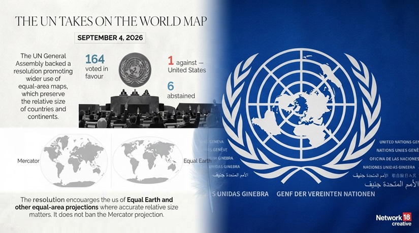
On September 4, the UN General Assembly voted to stop treating the Mercator map as the default picture of the world. Led by Togo and the African Union, the “Correct the Map” resolution passed almost unopposed. It changes no borders. But it says something plain: for 450 years, the world has been looking at Africa through a map that makes it look smaller than it is — and that was never an accident.
UN “Correct the Map” vote breakdown (4 September 2026)
| Category | Number of countries | Notable details |
|---|---|---|
| Voted in favour | 164 | Broad support from African, European, Asian and Latin American states; resolution adopted. news.un+2 |
| Voted against | 1 | United States was the sole “no” vote. ndtv+1 |
| Abstained | 6 | Six member states chose not to vote either way (specific countries not detailed in most reports). ndtv+1 |
Look at almost any classroom wall map, and Greenland looks about the same size as Africa. It isn’t. Africa is roughly 14 times larger. That gap between what a map shows and what is actually true is the whole reason 164 countries just voted for something unusual at the United Nations: a resolution about how maps are drawn.
The text is called “Correct the Map: rebalancing global cartographic representation and promoting equitable representation of the world’s regions, particularly Africa.” It does not redraw a single border. It does not touch anyone’s territory. What it does is ask governments, schools, publishers and tech companies to stop defaulting to a 16th-century map that quietly shrinks Africa, Latin America and South Asia — and start using maps that show the world’s regions at their true relative size.
WHY THIS MAP FIGHT STARTED: AFRICA VS. GREENLAND
| Feature | Africa | Greenland |
|---|---|---|
| True land area | ~30.4 million km² | ~2.2 million km² |
| Relative size in reality | About 14 times larger than Greenland | Roughly 1/14th the size of Africa |
| How they look on a Mercator map | Appears similar in size to Greenland (visually understated) | Appears almost as large as Africa due to polar stretching |
| Reason for distortion | Mercator compresses equatorial regions | Mercator stretches land near the poles, inflating high‑latitude areas like Greenland |
Where the idea came from
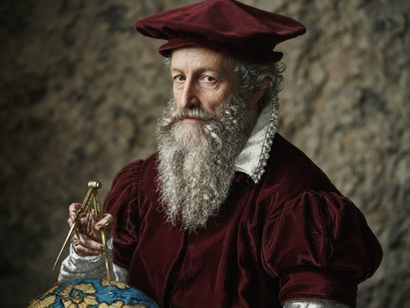
The Mercator projection was drawn up in 1569, by a Flemish mapmaker, for one job: helping European sailors navigate. It is very good at that. It is much less good at showing true size, because it stretches land the further it sits from the equator. Countries near the equator — most of Africa, Latin America, South Asia — end up looking smaller than they are. Countries near the poles — Europe, North America, Russia — end up looking larger. It has stayed the world’s default map for 450 years anyway, printed in atlases, hung in classrooms, and built into most online map tools.
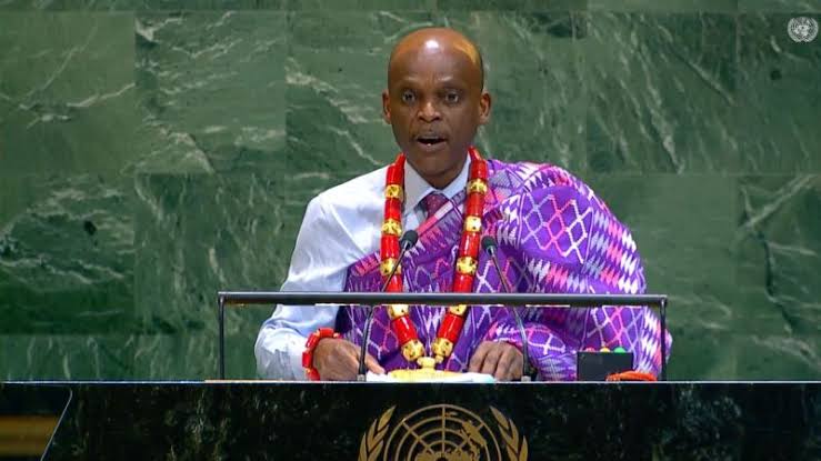
The push to change that started in Togo. The West African country’s foreign minister, Robert Dussey, has argued for years that this is not a small design flaw. Maps, he said, guide education, nourish the imagination, and influence collective perceptions.
The African Union agreed, and in February 2026 formally endorsed the “Correct the Map” campaign at its annual summit, linking it to the AU’s own 2025 push for recognition and reparations for historical injustices against Africans. Togo then carried the idea to the UN on behalf of Africa’s 54 member states, with the Bahamas co-sponsoring, and the text passed on September 4.
What the resolution does — and doesn’t do
It is worth being precise here, because this is the part most likely to get exaggerated in either direction.
It encourages:
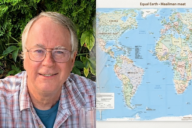
Wider use of “equal-area” map projections — especially Equal Earth, a map designed by cartographers in 2018 — in schools, textbooks, media, government materials and mapping technology, wherever the relative size of countries and regions actually matters.
It does not:
Change any country’s borders, maritime boundaries or legal territory. It is not binding under international law — no government, school or company has to comply, and there is no penalty for ignoring it.
The European Union’s own statement at the UN underlined this directly, stressing that the resolution’s scope is limited to education and geographic literacy, and has nothing to do with sovereignty or borders. That distinction matters, because Africa’s difficult history with outside powers redrawing its map by force makes this a subject where confusion could spread fast. This is not that. It is a resolution about pictures, not property.
The politics behind a map
A vote this lopsided — 164 to 1 — rarely happens at the UN on anything contested. But the story is in the details of who didn’t vote yes, and what they said about it.
United States
Cast the only “no” vote. A US representative dismissed the resolution as part of a wider ideological push, calling such measures barnacles on our work here
that damage the UN’s credibility.
Estonia, Georgia, Lithuania, Moldova, Serbia, Ukraine
Abstained, without issuing a detailed public objection to the resolution’s substance.
France & the EU
Backed the resolution, while formally noting that it does not touch questions of sovereignty or borders in Europe, Africa, or anywhere else.
African Union
Celebrated the outcome, saying the vote reflects Africa’s true scale, weight, and place in the world.
Tom Patterson, co-creator of the Equal Earth map
Said he was startled by the resolution, when he and two colleagues built the projection in 2018, we never imagined this.
Read together, the reactions say something about global politics beyond maps. For the US, this was one entry in a longer-running argument about whether the UN should spend its time on symbolic, identity-linked resolutions at all — a debate that has followed reparations and historical-justice initiatives at the UN more broadly. For African and Caribbean states, this was a rare case of winning that argument decisively, on a subject simple enough that almost no country wanted to be seen publicly defending a distorted map of the world’s second-largest continent.
Why a map is worth fighting over
Researchers who study how children learn geography have found that the maps people grow up with shape how they picture the world for the rest of their lives — which regions feel central, which feel like afterthoughts. Africa’s advocates argue that a map that visually shrinks the continent, generation after generation, has fed real-world habits of mind: investors, journalists, and policymakers who unconsciously treat Africa as smaller and less consequential than its 1.5 billion people and $3 trillion-plus economy actually make it.
AU officials have called this part of Africa’s “narrative sovereignty” — the right to control how the continent is seen and described, not just governed. It sits alongside other African-led pushes at the UN, including a March 2026 declaration recognising the transatlantic slave trade as a crime against humanity. Correcting the map is a smaller, more concrete piece of that same argument: that fixing how the world sees Africa is not a side issue, but part of the same work as fixing how the world treats Africa.
“Correcting the map is a matter of justice: recognising and contesting inherited ways of seeing.” — commentary published on Verfassungsblog, September 2026
What changes now — and what doesn’t
Because the resolution is non-binding, nothing changes automatically. What happens next depends on thousands of individual decisions: whether an education ministry updates its wall maps, whether a publisher redraws its next textbook edition, whether a mapping app changes its default view. Togo has already said it will update its own national geography materials by the end of 2026, and the AU is encouraging other member states to follow. Media outlets and infographic designers are among the likeliest early adopters, since switching a chart or graphic is far simpler than reprinting a national curriculum.
It is also worth being honest about the limits. A more accurate map will not, by itself, bring investment, cancel debt, or resolve a single conflict. It does not fix unfair trade rules or unequal access to global finance. Its backers know this. The resolution’s real claim is narrower and more achievable: that how the world pictures Africa should match how large, populous and consequential Africa actually is — and that getting the picture right is worth doing, even if it changes nothing else on its own.
A symbolic win is only worth as much as what follows it
The UN vote was the easy part. What happens in classrooms, newsrooms and map apps over the next year will decide whether “Correct the Map” becomes a real shift or a resolution nobody implements. Three things worth doing with this moment:
- Check what map your own school or workplace uses. If it’s Mercator, ask whether an equal-area alternative like Equal Earth is available for teaching or presentations — most mapping software already supports it.
- Push publishers and media houses to follow through. Readers and educators asking for accurate maps in textbooks and news graphics is what actually moves adoption, faster than any UN resolution can on its own.
- Separate the symbolic win from the material work still owed to Africa. Welcome the resolution, but keep the pressure on the issues a map alone cannot touch — investment, debt, fair trade terms and security.
A map is not the territory. But for 450 years, it has quietly told a story about whose territory matters more. Changing the picture is a small, overdue correction — the larger one is still being written.